How It Works

In short, I’ve written a program to look at the N-day charts (where N = 5, 10, 15, and 20 days) for several popular ETF funds and will update the results here after each trading day. Using proprietary Neural Network algorithms, the program predicts whether the N-day High and Low prices will be breached in the next N days. When you look at the charts presented here, pay attention to the green and red lines that’ll usually appear at the top and bottom margins of the charts!
So technically, my model assumes that the N-day high and low prices are the support and resistance in the next N trading days and will predict whether these support and resistance prices will hold.
If the top line is green, it means that price is likely to rise above it in the next N trading days (where N is the # of bars on the chart, e.g. a 10-day chart.)
If the top line is red, it means that the price is unlikely to rise above it in the next N trading days.
If the bottom line is red, it means that the price will likely fall below it in the next N trading days.
If the bottom line is green, it means that the price will unlikely fall below it in the next N trading days.
And occasionally, you will see either the top or bottom or both lines missing. This merely indicates that the program is unable to make a prediction for that particular support or resistance line based on the most recent data.
Btw, the program only determines whether the line will ever be breached in the next N trading days; it doesn’t imply that’s where the price will end up. In fact, it’s entirely possible for the top line to be green and the bottom line to be red which is a prediction that BOTH the N-day High AND Low will both be breached some time in the next N trading days which implies an increase in volatility going forward.
Keep in mind these are merely predictions! There are no guarantees that they’ll come true! From my own backtesting, every prediction about each individual support/resistance line has about a 70% chance of coming true. Since each chart has 2 lines, using the laws of probability, there’s only about a 50% chance that that specific scenario depicted will actually play out in the next N trading days. These numbers vary widely depending on the market conditions but these are the averages over the backtesting results spanning decades and in several different securities. (However, compare that to merely flipping a coin: you’d be about 50% accurate in predicting whether each line will hold and 25% accurate in predicting whether both lines will hold.) In the future, I will be posting the backtested results of my program going as far back as the 1980s. And if you’ve read my disclaimer, you should be well aware that past performance doesn’t imply future performance.
The Role of Neural Networks
(While I won’t discuss the technical aspects of Neural Networks in great length in this article, you can read up on the details of its implantation on Wikipedia.) In the late 1970s to the early 1980s, the US Post Office began using handwriting recognition to efficiently process large volumes of mail. Letters would be scanned through machines that would read the zip code which made it possible to automatically route the mail to the carriers assigned to that particular zip code. The neural networks responsible for recognizing zip codes written on letters were trained using thousands of handwriting samples of the digits from 0 to 9.
As for me, I also employ Neural Networks in identifying patterns in stock charts. But unlike the post office deciphering handwriting using their computers, I look for patterns in the stock chart that indicate whether a breakout beyond the previous highs and lows is imminent. Quandl provides the market data and GNU R provides the platform for running my program.
Let’s walk through an example
Here I have a 20-day chart of IBB, the iShares Nasdaq Biotechnology ETF as of November 17, 2015 that my program has generated and predicted future breakouts for.

Although it’s not printed on the chart, I’ve noted the high and low prices of this ETF during the 20-day period up to Nov 17 on my post for IBB on that particular day: 341.25 and 295.10 respectively.
Take a look at the top line @ 341.25. It’s green which means it’s likely to be exceeded some time in the next 20 trading days.
Then take a look at the bottom line @ 295.10 which is also green. This means is is not likely to be breached in the next 20 days. (Please don’t confuse this and interpret green to mean the bottom line will be breached. Instead, associate green with a bullish view regarding the support and resistance lines.)
Let’s look at another example
Here is the 15-day chart of SLV, the iShares Silver Trust ETF, as of November 17, 2015.
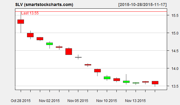
The 15-day high and low are 15.60 and 13.47 respectively from the page.
You’ll notice that there’s red line at the top which indicates that the high of 15.60 will not likely be breached in the next 15 days (a bearish view which is reflected in the red.) However, notice that there is NO red or green line at the bottom. (The grey line doesn’t count since it’s part of the chart legend so don’t confuse that.) This simply indicates that the program has been unable to make a prediction about whether the current 15-day low will hold in the next 15 days, So NO Line = Inconclusive.
One last example, OK?
Here is the 20-day chart of XLE, the Energy Select Sector SPDR Fund as of Nov 17, 2015:

I specifically picked this chart because it can be a bit confusing, especially for newcomers, to interpret. There’s a green line at 71.93 and a red line at 65.11 which implies it’s likely to break out above 71.93 AND below 65.11 in the coming 20 days. How could that be?
Keep in mind the green line at the top is to be interpreted as “in the next 20 days, it’s likely XLE will trade above 71.93 at least some of the time.” and the red line at the bottom should be interpreted as “in the next 20 days XLE will likley trade below 65.11 at least some of the time.” I call this the “increasing volatility” state since the stock is predicted to exhibit a wider range in the next 20 days compared to the previous 20.
Final Thoughts
I hope I’ve covered the basics of how to read and interpret the stock charts on my site. In the future, I’ll be writing and posting an app on this site that’ll allow you to run this analysis on ANY stock of your choice, even foreign stocks. If you have any questions or suggestions, please don’t hesitate to contact me! (And if I collect enough of these questions, maybe I’ll post a FAQ in the future!)


