Stock Charts and Other Tools for Understanding the Market
Stock Charts and Other Tools for Understanding the Market
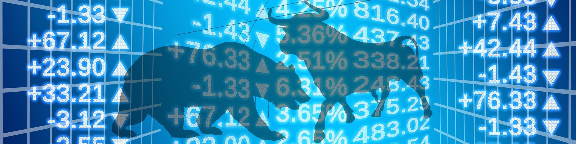
 For many beginner traders and investors, learning to read stock charts often ends up being an exercise in futility. First, the different types of candlestick patterns like double/triple bottoms, wedges, broadening tops, etc. are not rigorously defined and involve a bit of judgement depending on the person reading the chart. Second, there’s a ton of debate over whether technical analysis and reading stock charts even leads to higher risk-adjusted returns on average. You may have heard of the Efficient Market Hypothesis and end up jumping to the conclusion that you shouldn’t be wasting your time with technical analysis since “there’s no free lunch” in the financial markets. However, not all market participants (including algorithmic traders) trade in a completely rational manner, especially when the markets are under tremendous stress like in 2008 and 2011; this often leads to inefficiencies which you can potentially profit from. Later in this article, I’ll discuss the most easily identifiable chart patterns which signal an irrational market that’s under stress as well as other tools which you can use to gauge the psychology of market participants.
Table of Contents
- Technical Analysis vs the Efficient Market Hypothesis
- An Intro to Behavioral Finance
- Important Chart Patterns
- The Key: Understanding the Sentiment
- Conclusion
Technical Analysis vs the Efficient Market Hypothesis
There’s an old anecdote which epitomizes the efficient market hypothesis (EMH):
Two finance professors (who believe in the EMH) spot a $100 bill on a sidewalk. The first one asks if the 2nd would like to pick it up. The 2nd one replies that it can’t be true because if there really was a $100 bill on the ground, someone would have already picked it up!
According to the EMH, there is no “free lunch” in the markets since the slightest inefficiency in the price of any security will be ephemeral since all market participants are greedy. Some greedy trader would have already bought and sold (or shorted and covered) that security for a quick profit and corrected the pricing inefficiency in the process. But here’s a reality check: not everyone who participates in the financial markets is aware of all the potential inefficiencies that currently exist or has the time, competence, or capital available to take advantage of it. Going back to example of the money lying on the sidewalk, there are a plethora of idiosyncratic reasons why a passerby might not have picked up the $100 bill including:
- They simply didn’t see it there.
- They valued their time so much that they didn’t bother to stop and pick it up.
- They were superstitious about getting free money.
Similarly, not everyone who trades in the financial markets exhibits the same identical selfish behavior (although we’re slowly getting there due to the proliferation of high frequency traders but that’s a topic for another day.)
[Back to Table of Contents]
An Intro to Behavioral Finance
Newsflash: market efficiency is not always a given. Not everyone who participates in the financial markets trades in a 100% rational way, especially when the markets are under considerable stress, including the world’s top fund managers, investors, and CEOs. Although there are a ton of psychological biases that affect investors, here are some of the most common ones which lead to inefficiencies (and consequently, opportunities to make money) in the markets:
[Back to Table of Contents]
Loss Aversion
If you give a child a piece of candy, he/she will most likely be elated. Now if you give the same child 2 pieces of candy and then take one of the pieces away a few minutes later, you’ll most likely be met with anger and resentment even though their net gain is still 1 piece of candy. (OK, I made up this example of giving and taking away candy from a child but a real experiment was performed with monkeys showing similar results.) This principle is no different for humans as well. People, after being shaped by centuries of evolution, tend to worry about protecting against potential losses far more than missing out on potential gains; this explains why most securities tend to slowly take the stairs on the way up but take the elevator on the way down.
Although I don’t have any absolute proof for the concept but I also hypothesize that algorithmic traders (like HFTs) are also affected by Loss Aversion. The algorithms are designed by real people working for real trading firms that have finite capital and a defined risk tolerance. Many of these algorithms are designed to pull out of the market after hitting a particular loss threshold (so the firm doesn’t suffer an unreasonable loss or go bankrupt) even if they were just plain unlucky and their chances of making back their losses in the near future using the same algorithms is fairly certain.
[Back to Table of Contents]
Recency Bias
The ubiquitous disclaimer that “past performance does not guarantee future performance” just goes to show how rampant this bias is in our investing lives. In a nutshell, it states that we tend to subconsciously believe recent events in the markets foreshadow the future. For example, a stock plunges 10% in a single day and spooks most investors away from buying it for quite some time. Often, recency bias ends up creating a self-fulfilling prophecy: the stock that plunged 10% in a day will likely continue its downtrend because few people will dare to buy it having seen that massive single day loss. (Jump below to the flag and pennant pattern if you want to take advantage of this psychological shortcoming in your trading.)
[Back to Table of Contents]
Herding Mentality
If you find yourself making a particular trade because “everyone else is doing it”, then you are guilty of the herding mentality. In other words, this bias is evident if you are judging an investment based on its popularity rather than its merits. In some instances, herding can be beneficial to the markets in the case of an obviously and severely undervalued security that’s being bought by investors like crazy. Other investors who see their (presumably) more knowledgeable friend jumping in also end up snatching up that same stock and it rapidly goes from undervalued to fairly valued.
However, due to a degree of subjectivity over the fair value of an investment and another psychological bias in play, the endowment effect, investors will tend to be reluctant to sell, causing the investment’s market value to overshoot past what is deemed as fair value for most. The herding mentality when coupled with the recency bias can often lead to spectacular bubbles and crashes in the extreme case.
[Back to Table of Contents]
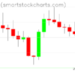
Stock Charts and Important Patterns
I’m going to take a somewhat different approach than what you may have been taught when it comes to reading stock charts. Instead of memorizing dozens and dozens of chart patterns and then trying to determine which particular pattern (out of the countless you’ve memorized) your stock is exhibiting, we’ll only memorize a few. I’ve picked 5 patterns that are fairly common and yet relatively easy to identify complete with explanations of the psychology that’s behind them.
From now on, I want you to change your mindset: instead of asking yourself “what stock chart pattern is that?” ask yourself “what are the investors on both sides of the trade thinking?” A lot of patterns may look alike and since we’re all human, we may end up misidentifying certain patterns. But if we understand the psychology of the participants trading that particular stock as the pattern emerges, we’ll have a better shot at being on the right side of the trade. Most traders look at the chart and then infer the probable outcome based on the pattern. Instead, we’ll use the patterns (as well as other indicators) to determine the psychology or sentiment behind that investment and trade based on that.
[Back to Table of Contents]
Pattern 1: The Dead Cat Bounce
We’ve learned (hopefully not the hard way) that it’s a stupid idea to catch a falling knife in the financial markets. So naturally, when we’re in bottom-fishing mode, we think we’re smart enough to not catch falling knives and instead, only buy stocks that have bounced back a little after a prolonged crash. Unfortunately, buying a minor rebound after a major decline will likely prove just as disastrous. First, a lot of people are probably shorting that security on the way down and the rebound is simply due to those who are covering their shorts to take profits. Unless there’s a radical change in the stock’s sentiment (say due to a sudden positive change in its fundamentals), the bears will likely remain in control for the foreseeable future.
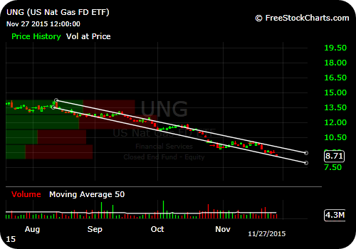
Whenever you buy a falling knife or a dead cat bounce, you’re essentially betting that the security has already bottomed (akin to a V-shaped bottom) despite being in a long and endless downtrend. Yes, V-shaped bottoms do happen (most notably when the S&P500 bottomed in March 2009 following the long and harrowing downtrend that began with the 2008 crash), but more often than not, there’s a period of sideways consolidation before the bulls finally beat the bears. When you find yourself wanting to catch a falling knife or facing a dead cat bounce, ask yourself the following questions:
- Have any similar rebounds occurred in the past before the stock continued to even lower? Why is it any different this time?
- What caused this stock to plunge so much? What’s the catalyst in the present or future that’ll cause it to recover and put the bulls in control? Is this catalyst comparable in magnitude with the catalyst that brought it all the way down?
- Put yourself in the shoes of someone who is shorting that stock. How would you be feeling right now? Are you genuinely worried that this rebound marks the end of the downtrend (and your gravy train to trading profits)? Would you be looking to short more from here?
In the next section, you’ll learn of a pattern which may emerge to signal the end of a dead cat bounce: the reverse head and shoulders pattern.
[Back to Table of Contents]
Pattern 2: Head and Shoulders Pattern
A stock making higher highs and higher lows is the hallmark of an healthy uptrend. New buyers of the stock are positive of its future prospects but do not wish to buy too high so they wait for any pullback to get in which pushes the price back to new highs. Many of the traders going long will have protective stops put in below the most recent low; they deem that the uptrend is over if it falls below the most recent low and would like to get out by then. And although the stock is in an uptrend, there are plenty of bears waiting on the sidelines for an opportunity to short the stock from near its highs.
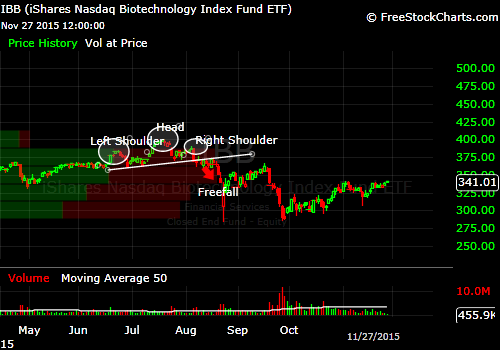
Things start to get interesting when the stock makes a new high and then drops close to its most recent low. Most of the stops that the long side have put in haven’t triggered yet. If at this point the stock rebounds but fails to make a new high, things will get ugly. The bears see the failure to make a new high as a technical weakness or a sign that the trend is over while many bulls who have been comfortably riding this stock higher will likely have missed this because they’re not likely monitoring the stock as frequently as the bears since they’re relying on their stop losses to do the job. As the bears short the right shoulder, the stock begins to fall. Once the previous low is breached, the bulls’ stop losses are triggered, causing the decline to accelerate. In essence, a head and shoulders is often a sign that plenty of bulls have been trapped on the long side once the bears started to short the stock, causing it to plunge very dramatically.
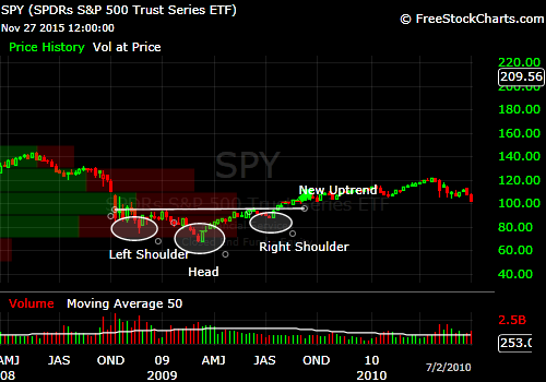
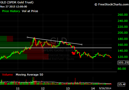
The head and shoulders pattern can also be inverted and appear to sometimes signal the end of a prolonged decline or dead cat bounce. Plenty of bears shorting the dead cat bounce are caught on the wrong side when the stock fails to make a new low and the bulls pile in, driving up the stock price and running the bears’ stop loss orders which further powers the new rally.
[Back to Table of Contents]
Pattern 3: Cup with Handle
Picture this: you buy QQQ (formerly QQQQ), the Nasdaq-100 ETF near its 2007 peak at around $50 for your retirement account as a long-term investment. Within months of your purchase, your investment craters. You regret this purchase as you watch the price plunge to $40 and then $30 in 2008 and get an extremely bad taste in your mouth. You’ve finally decided that you want to get out but not at these depressingly low prices. So you wait for prices to rebound. The market recovers in 2009 and in April 2010, you’re back near your original purchase price of $50 where you finally sell your investment. When large numbers of longer-term investors like you are badly burnt by a nasty bear market and are set on getting out but do not want to sell at a low price, the security may end up with the cup and handle pattern.
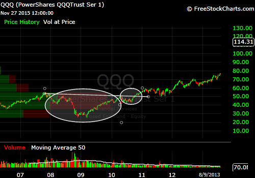
The first portion of a cup and handle pattern consists of a massive decline followed by a nearly equally strong recovery which forms a cup that resembles the letter “U”. The second portion begins as the investment regains its previous peak and consists of a lesser and shorter pullback as the investors who wished to get out near breakeven manage to temporarily depress the price of the stock. (It’s not unheard of for the handle to be preceded by a small head and shoulders formation.) While the correction encountered in the handle is nowhere as severe as the cup, it’s usually big enough to flush out some of the weaker hands.
[Back to Table of Contents]
Pattern 4: Ascending and Descending Triangles
Triangles come in many forms on stock charts but there’s one particular type of triangle that’s relatively simple to identify and understand: Ascending and Descending triangles. Let’s start with the Ascending Triangle first.
The ascending triangle starts out as a stock in a trading range. The top of the trading range stays fairly flat and consistent while the bottom of the range is upward sloping. This tends to happen when bulls start buying a stock that’s trading in a range; the range traders continue unloading the stock at the resistance while the bulls are putting upward pressure on the price, preventing it from falling all the way back down to resistance. Eventually, so much buying pressure builds up and the stock explodes out of the trading range.
The psychology behind the descending triangle is similar. Range traders are buying the stock at a fairly flat support while the bears are getting less and less patient as evidence by them selling at lower highs, effectively pinching the trading range closer. Eventually, the selling pressure knocks the stock out of the descending triangle and it sinks down below support.
[Back to Table of Contents]
Pattern 5: Flag and Pennant
This pattern usually happens when there’s a sudden shock to a stock’s fundamentals (i.e. earnings surprise, an analyst upgrade/downgrade, an unexpected lawsuit, a new product is proposed, etc.) and the stock suddenly shoots up or down a massive amount (usually in the double digits %-wise) in a single day or over a few days. If the shock happens in the same direction as the stock’s overall trend, then the flag would signal a continuation of the trend.
A bullish flag materializes when traders are speculating on some positive event occurring in the near future (i.e. positive earnings surprise, drug approval by the FDA, etc.) as evidenced by the uptrend. When that positive event not only occurs but ends up being even better than expected, the stock soars and all the bulls are euphoric! The bears, on the other hand, are too scared to short, at least initially, when the mood is so euphoric. A few days later, the bulls come to their senses. Some will decide to sell a portion of their holdings to lock in some of the sudden gains, causing the stock to trade in a short but weak downtrend. Plenty of people who did not get in this stock before the positive shock are now looking for any pullback to get in. The weak downtrend will last maybe a few days to a few weeks at most before new traders and investors pile in and the uptrend resumes.
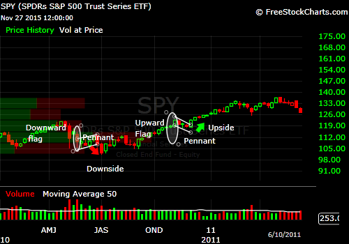
Similarly, a bearish flag happens when a lot of traders are short a stock in anticipation of a negative event and it ends up being much worse than expected. The stock plummets like a rock for a day or three and some of the bears decide to cover and take these quick profits, causing the stock to drift back up for a while after the crash. New and prospective bears use this weak short covering rally to establish new short positions and the stock continues its downtrend.
Before you trade a flag, always check if that stock is involved in a merger or acquisition. For example, if a stock that was previously trading for $30 is being acquired by another company for $40/share, then it’s likely to shoot up to $40 and drift around there until the acquisition happens. While you’re not likely to encounter huge losses if you mistakenly buy a company that’s about to be acquired, it’s gonna be frustrating to sit there and wait for the uptrend that’s probably not gonna happen.
[Back to Table of Contents]
Warning: These chart patterns do not work the way we’ve discussed here every single time!
Assuming you’ve correctly identified them, these chart patterns are not guaranteed to work 100% of the time (although you’ll likely have better luck heeding them than flipping a coin or hitting the casinos in the long run.) Always be prepared for the possibility that your stock will move opposite to what the most likely scenario is as dictated by the stock charts! In fact, if that happens, you’re probably not the only person caught with on the wrong side and flipping your position to the opposite side (say from short to long) might prove to be lucrative in theory. (Accepting your error in judgement AND flipping your position in practice is a bit emotionally difficult to say the least.)
[Back to Table of Contents]
The Key: Understanding the Sentiment
Ultimately, charts don’t move the markets – traders do, and thus chart patterns are not 100% reliable. In the end, you need to understand what the other traders are feeling on both sides of a trade in order for you to better anticipate what’s next. Chart patterns are one way to assess the psychology of other traders but it’s not the only method. Here are a couple of other ways to measure sentiment in the market:
[Back to Table of Contents]
#1: Stocktwits
Stocktwits is a Twitter clone specifically for the financial markets. Participants can post tweets about their favorite stocks and share their analysis here. Pay attention to the emotions of the traders here as you follow along the charts. Are a lot of traders scared of a particular scenario panning out? If so, expect a massive move in the stock if it does play out as many traders who are caught on the wrong side frantically try to get out.
[Back to Table of Contents]
#2: Twitter and Topsy
For some of the most popular stocks, Twitter is often a never-ending source of opinions and insight. Search for the ticker preceded with a hashtag “#” and alternatively, preceded with a dollar sign “$” as well. For example, to check on the sentiment of QQQ, do a search for #QQQ and $QQQ.
Update: Topsy is no longer in existence as of December 2015.
To quickly measure the overall sentiment score of a stock without spending a ton of time reading tweets, you can use Topsy. Topsy gives a sentiment rating between 0 and 100 with 0 being negative, 50 being neutral, and 100 being positive. (Topsy can actually measure the sentiment of anything that’s mentioned on Twitter including stocks.)
[Back to Table of Contents]
#3: Yahoo Finance Message Boards
Message boards are a bit more old school but you can uncover quite a bit about the overall sentiment of a stock through other people’s insecurities expressed intentionally (or unintentionally) on an anonymous message board. Simply go to Yahoo Finance, look up your stock, and select the “Message Boards” in the left margin. For example, here’s a direct link to the message board for SPY. Note that not all stocks have a respective message board dedicated to it.
[Back to Table of Contents]
Conclusion
Understanding the stock charts may help you gain an edge in your trading but it really comes down to understanding the psychology of other market participants that’ll give you the edge. In other words, it’s always good to double check if the traders’ sentiments match what the charts dictate.